Sizzling Shack
A fried chicken brand built on a two-shape rooster. Hot red and yellow, a repeating character pattern, and appetite-first photography that runs from the wrapper to the feed.
The Challenge
Fast food is decided in a fraction of a second — scrolling past a post, or picking up a wrapper. The brand has to create craving before anyone reads a word of it.
It also has to survive being printed on greaseproof paper and a cardboard clamshell, where fine detail and subtle colour simply do not reproduce.
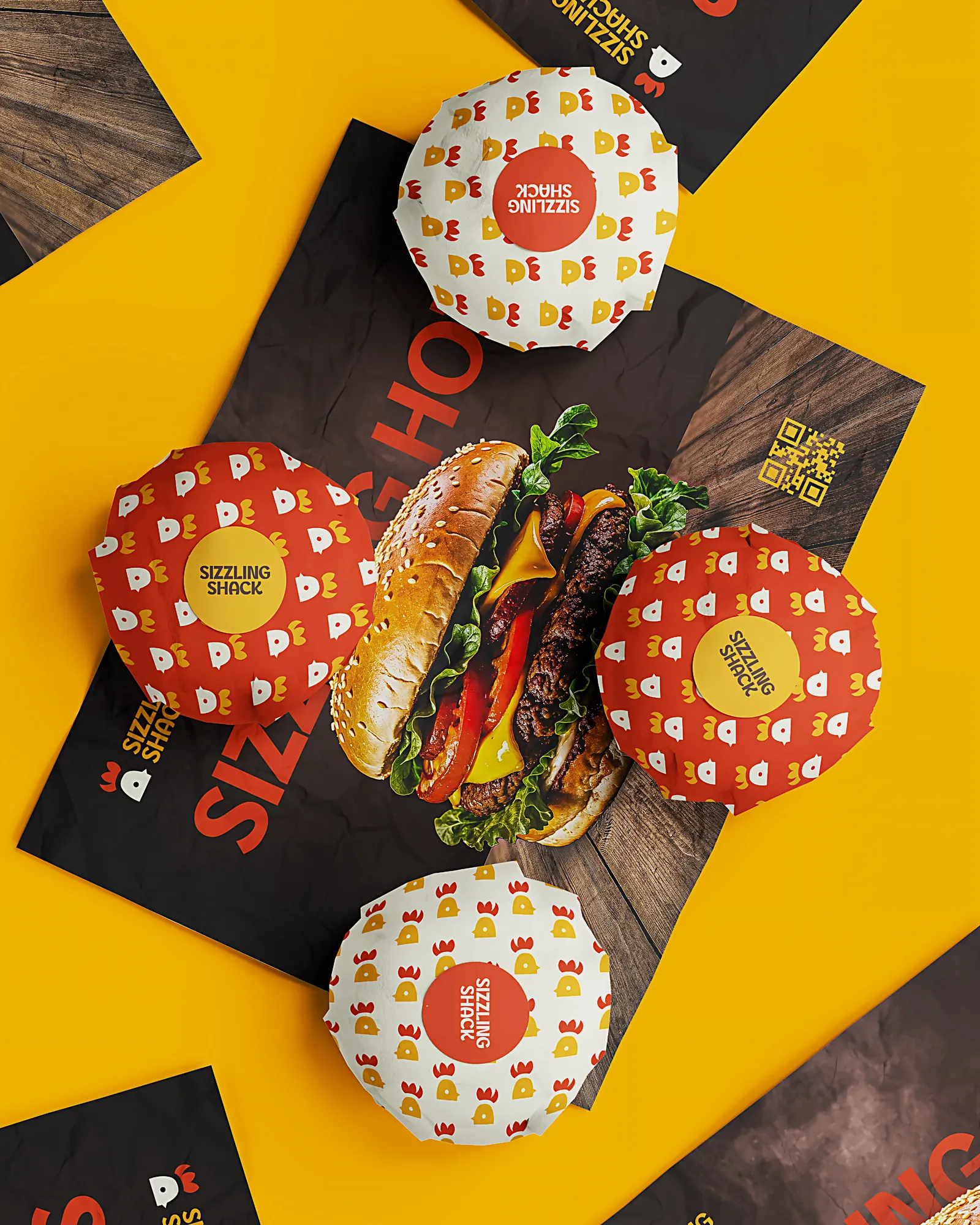
The Approach
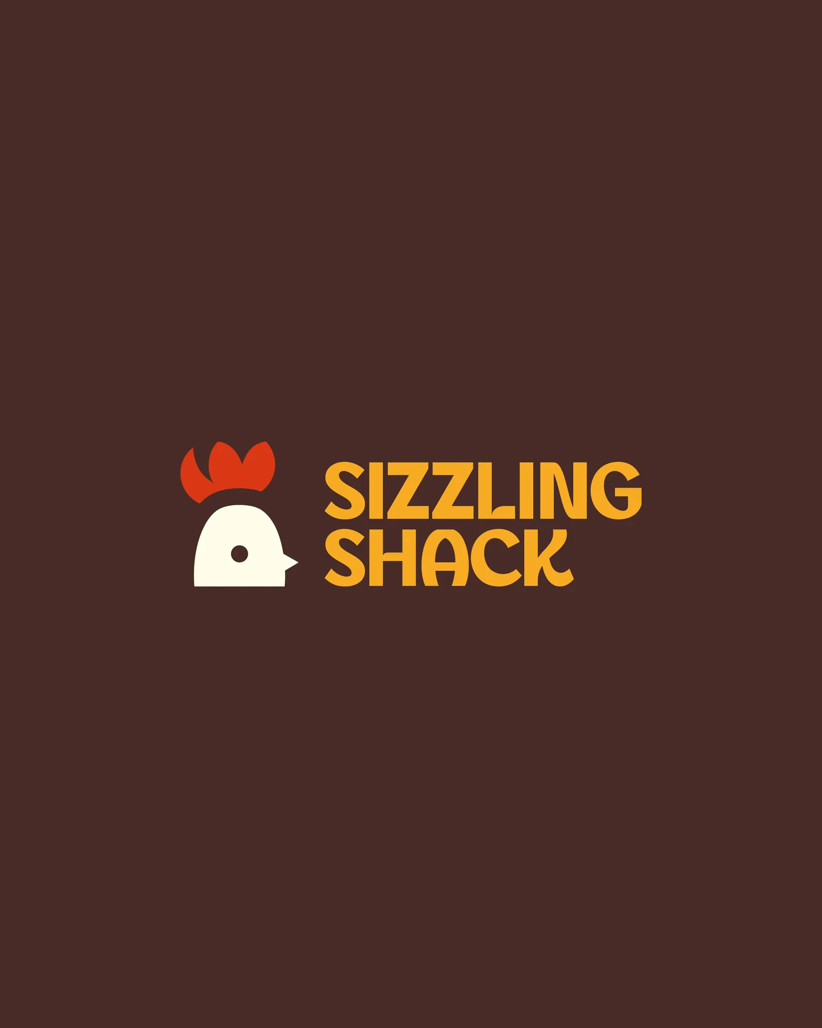
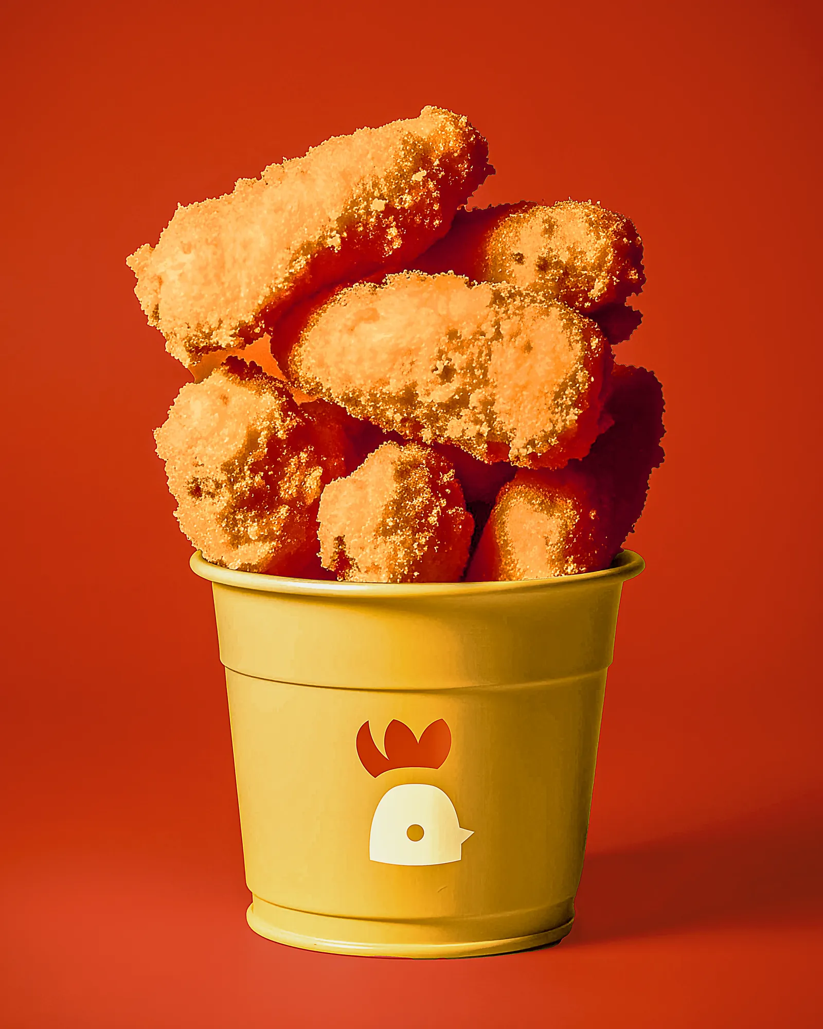
The mark is a rooster reduced to two shapes: a red comb and a yellow body, with a single counter for the eye. No outlines, no gradients — it prints in flat colour on any substrate and stays recognisable at wrapper scale.
Hot red and yellow give the brand immediate temperature, and heavy rounded type holds at thumbnail size where lighter faces disappear. Photography does the rest: close crops, hard light, food filling the frame.
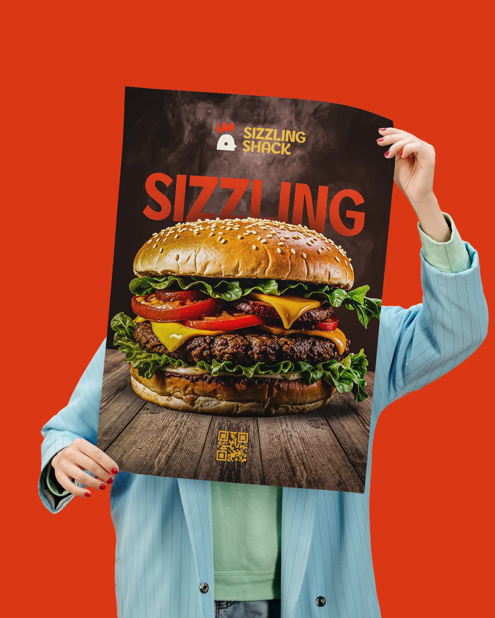
The System
Because the mark is two flat shapes, it tiles into a pattern that turns any blank surface into packaging — wraps, liners, bags and boxes all come from one asset. The same pattern and type rules carry into social, so a new offer goes out on-brand in minutes.