Monarch
A bass label built on a pixel crown and a checkerboard grid. Cyan, magenta and acid green against black — a system that runs from a vinyl sleeve to a pasted-up wall.
The Challenge
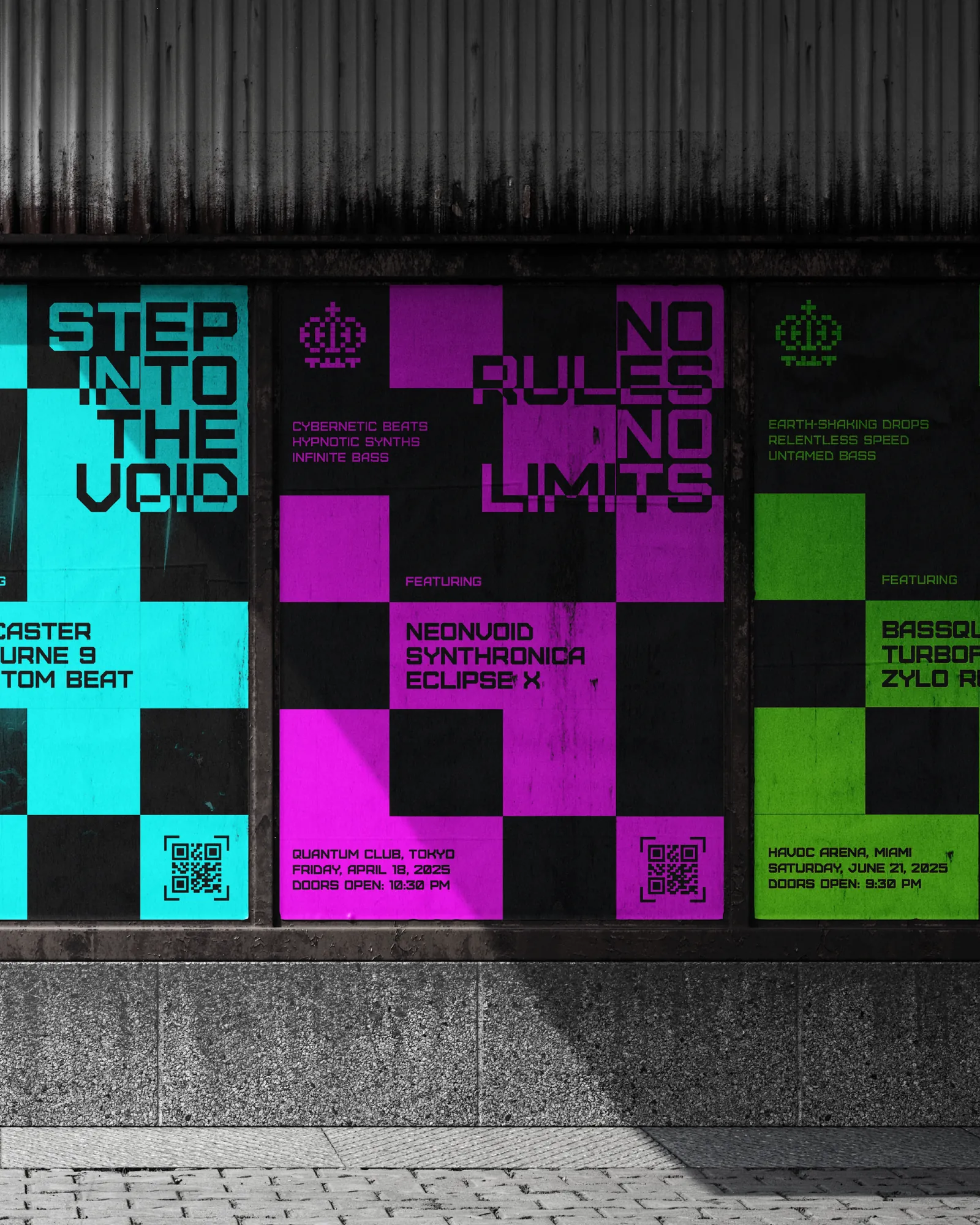
A label has to do two contradictory jobs. Its releases and events all look different by design, because the artists are different — yet the label itself has to be recognised instantly across every one of them.
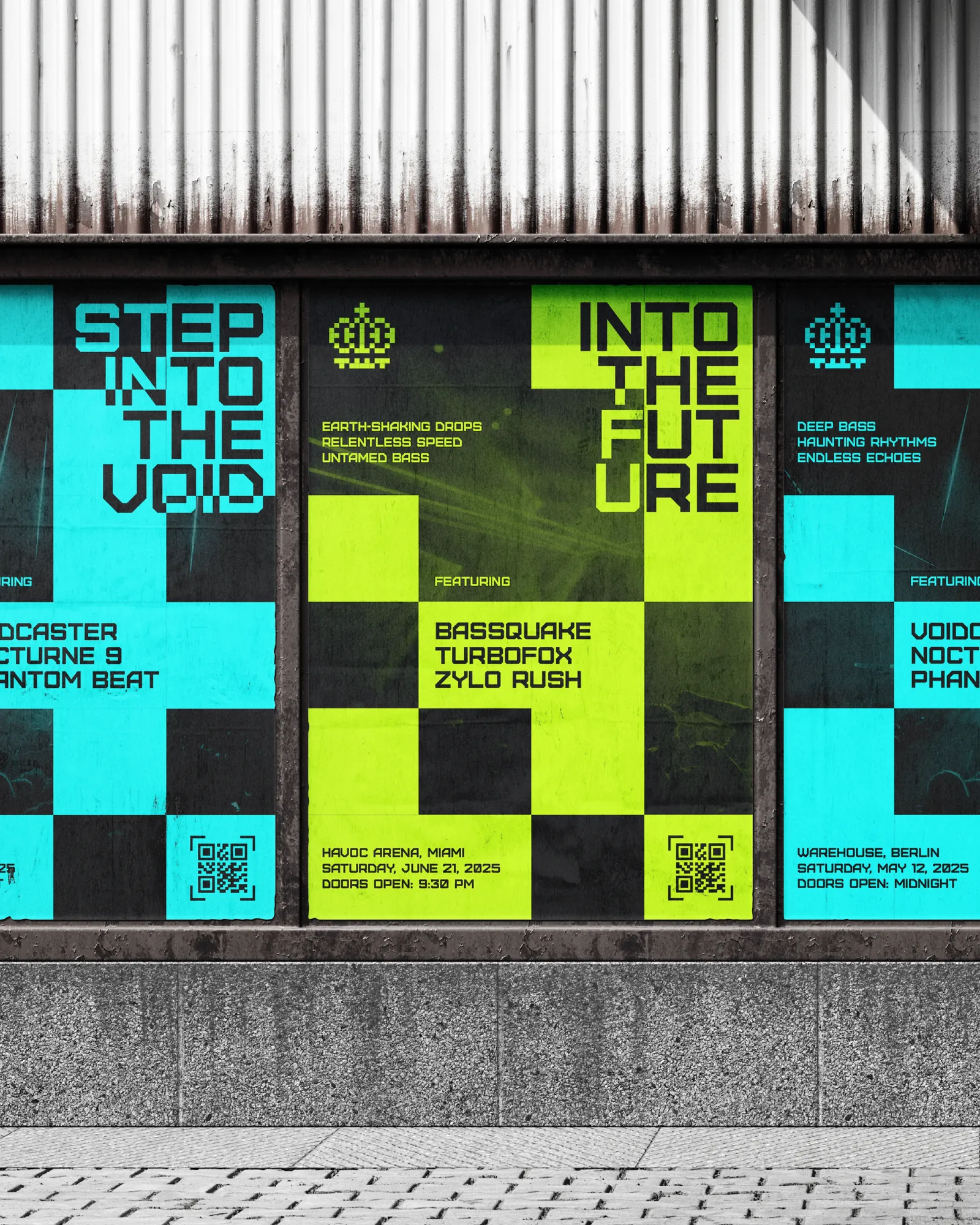
It is also seen in two places that could not be less alike: a phone screen at thumbnail size, and a wall of pasted posters glimpsed from across a street.
The Approach
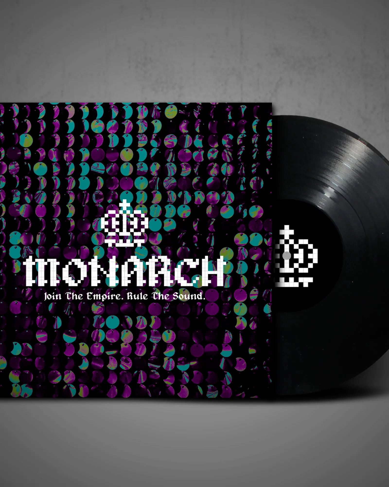
A pixel-drawn crown and matching bitmap wordmark give the label a mark that is unmistakably digital in origin — appropriate for electronic music, and legible even when it is reduced to a handful of pixels.
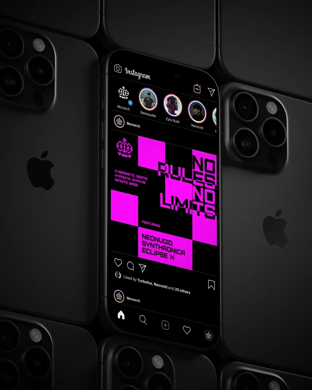
The layout system is a checkerboard grid. Cells hold type, colour or image interchangeably, so every poster is visibly the same system while never repeating a composition. Cyan, magenta and acid green sit on black and can be reshuffled per release without the label losing its identity.
The System
One grid produces a vinyl sleeve, an event poster, a story frame and a paste-up. Artist names, venues and dates drop into fixed cells, so a new show is a content change rather than a design job — which is what a release schedule actually demands.