Noor & Mould
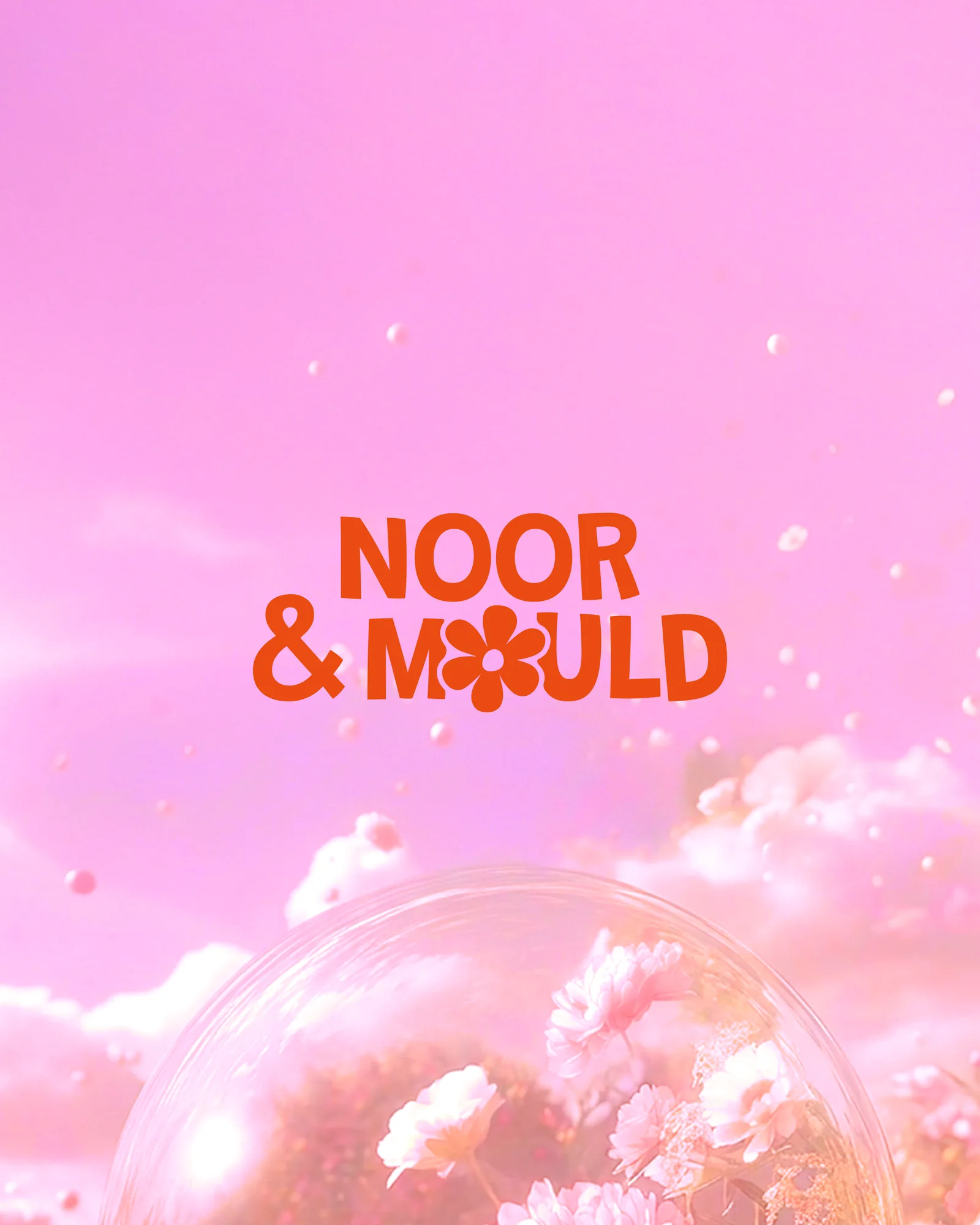
A candle maker whose real product is the afternoon spent making them. The identity leads with the workshop and lets the candles follow — a daisy set into the wordmark, and four colours loud enough to fill a room.
The Challenge
Handmade candle brands almost all look the same, and they look calm: beige, kraft paper, thin serif type, a great deal of empty space. It is a category that sells stillness, and it is extremely crowded.
This business is not really stillness. The candles sell, but the workshops are the thing — people come to pour and mould their own. A brand that reads as a product on a shelf sets up the wrong expectation, because what is on offer is an afternoon with your hands in wax.
The Approach
So the identity leads with the workshop and lets the product follow. That meant designing for a room full of people rather than a shelf: colour you can see across a table, and a mark simple enough to be pressed, poured, printed or stamped.
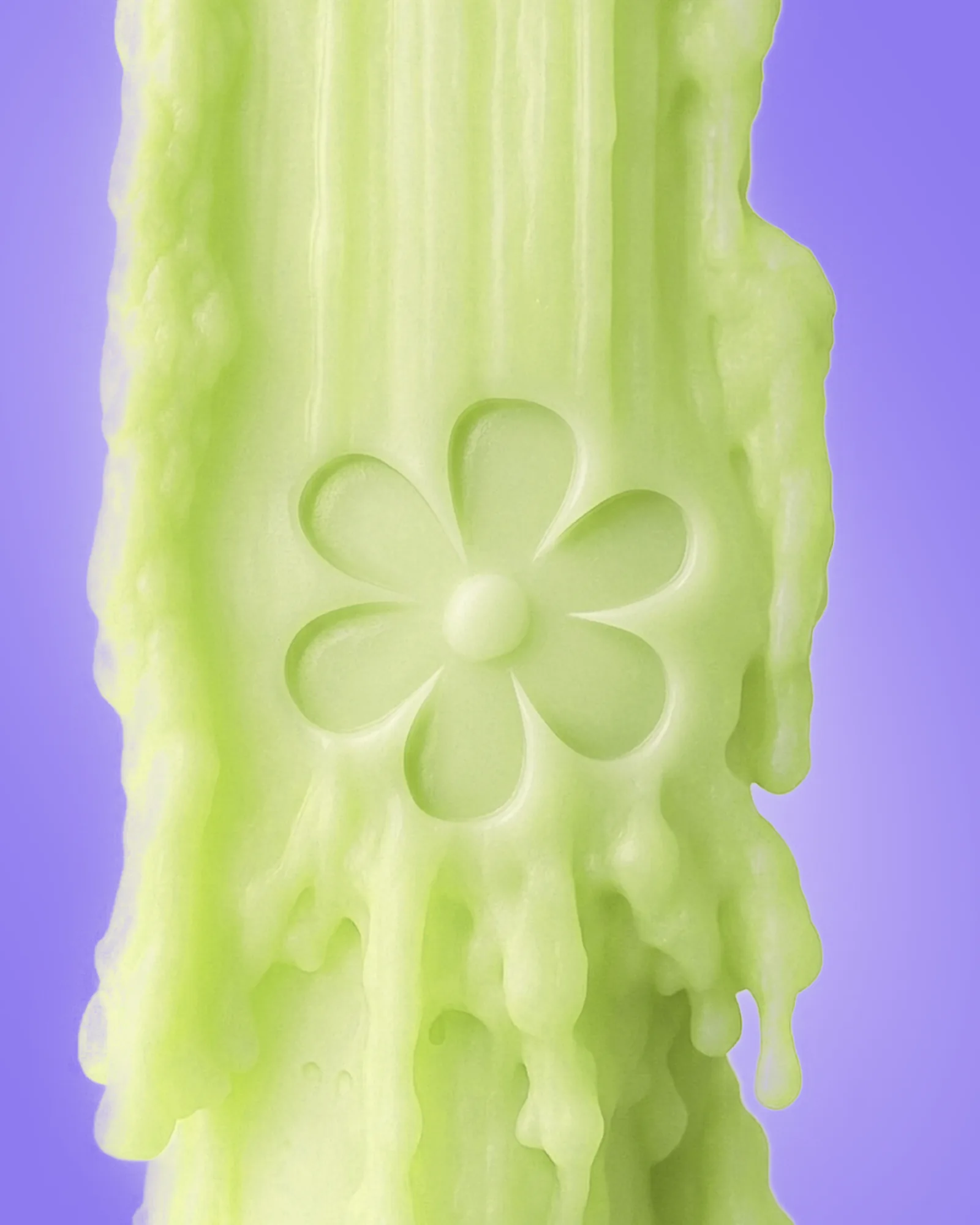
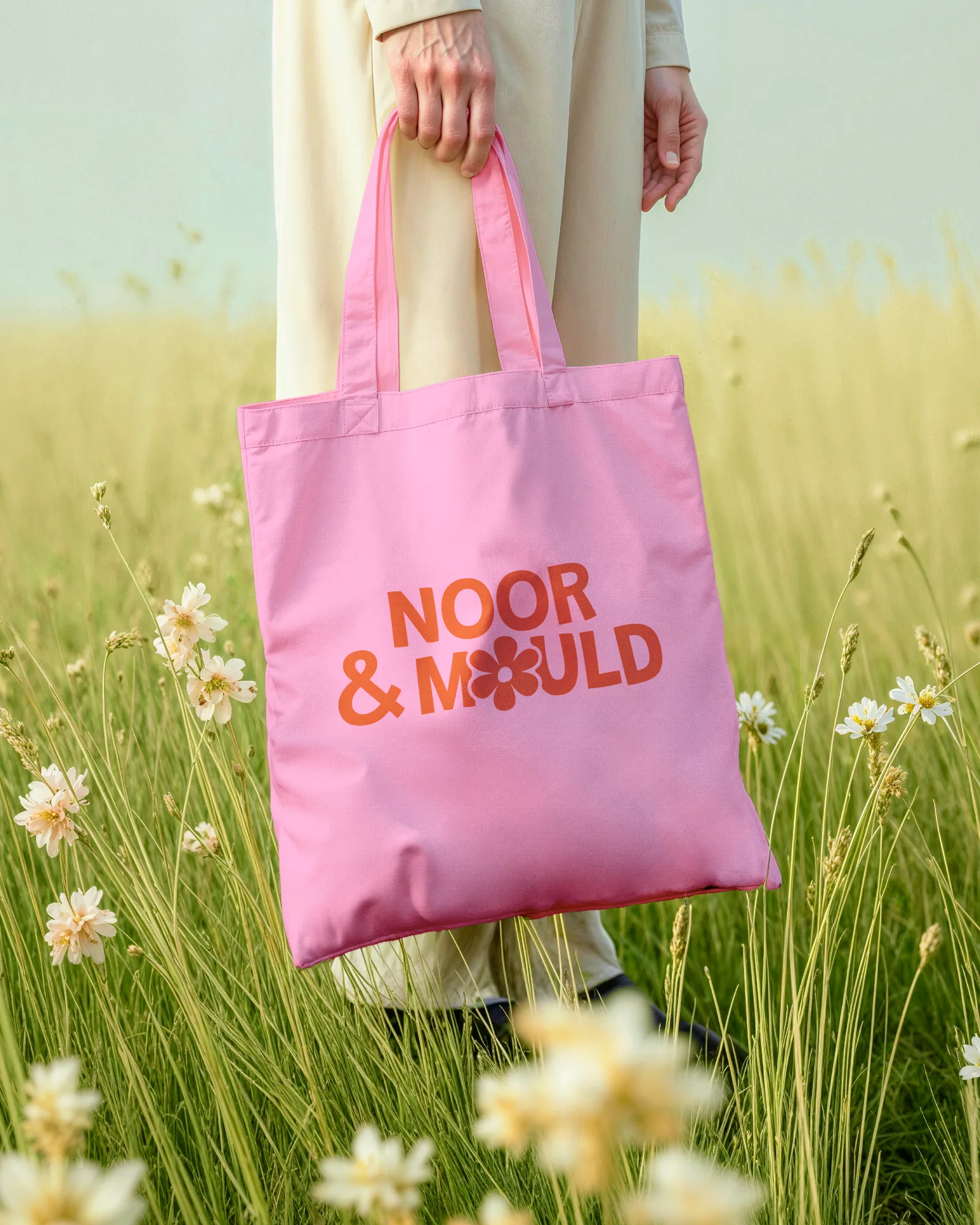
The daisy sits inside the wordmark, replacing the O in MOULD. It is the logo and the shape of a mould at once, which is the whole business in one character.
The System
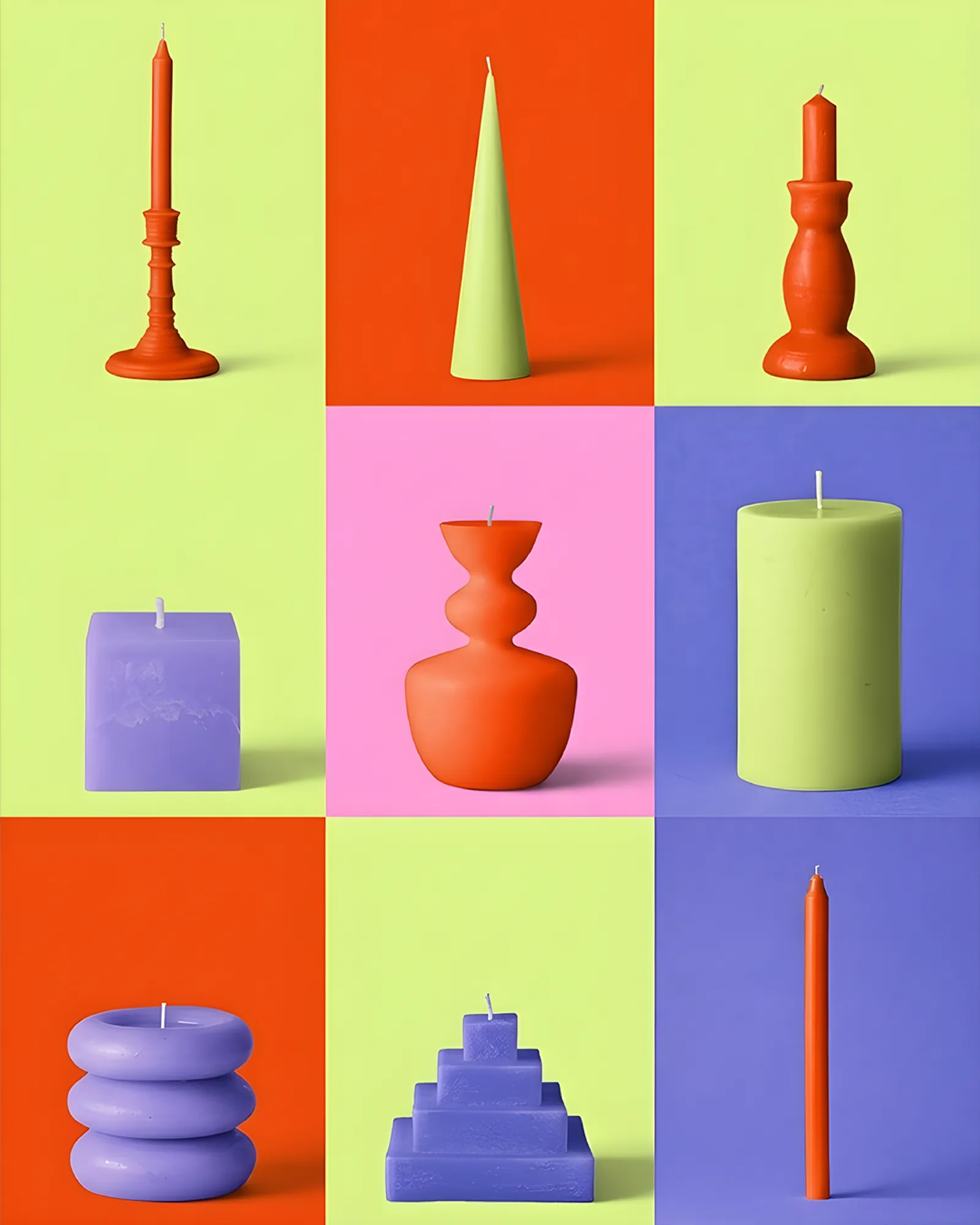
Four colours — orange, chartreuse, pink and violet — rotate rather than rank. Nothing is the primary, so no batch, no season and no workshop looks like the off-brand one, which suits a craft where every pour comes out slightly different.
The daisy repeats as a pattern where a surface needs filling, and stands alone where space is tight. Packaging, totes and cards are treated as things people carry home from a session rather than retail furniture.