Ashlameesh
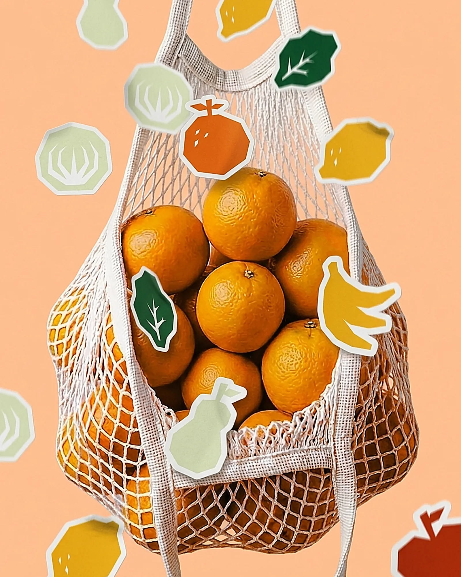
A fruit and cocktail store under one identity. Warm citrus tones, a family of illustrated produce badges, and photography that lets the fruit do the selling.
The Challenge
A fruit and cocktail store sits between two categories that usually look nothing alike. Grocers trade on freshness and honesty; cocktail bars trade on mood and indulgence. The identity had to hold both without splitting into two brands.
It also has to compete in a room where the product is already the most colourful thing present — so the branding cannot win by adding more colour.
The Approach
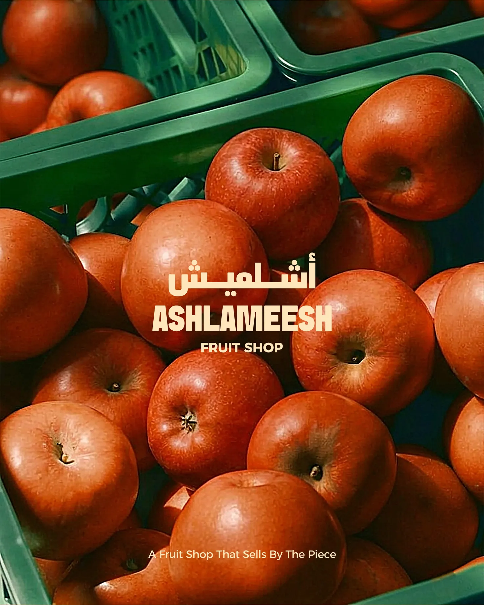
Photography leads, always. Real fruit, warm light, minimal styling, because nothing a designer draws will beat the produce itself for appetite appeal.
Around it sits a family of illustrated badges, each drawn flat on the same geometric footprint. They give the brand something ownable that a photograph never can, and they carry the playfulness the cocktail side of the business needs.
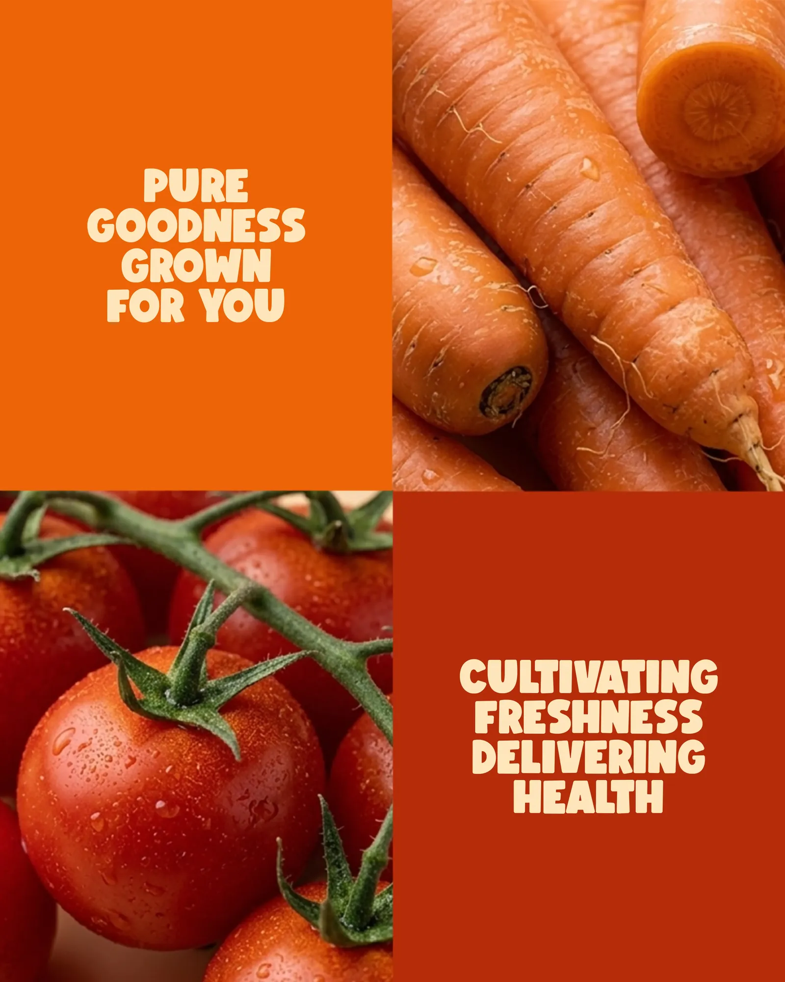
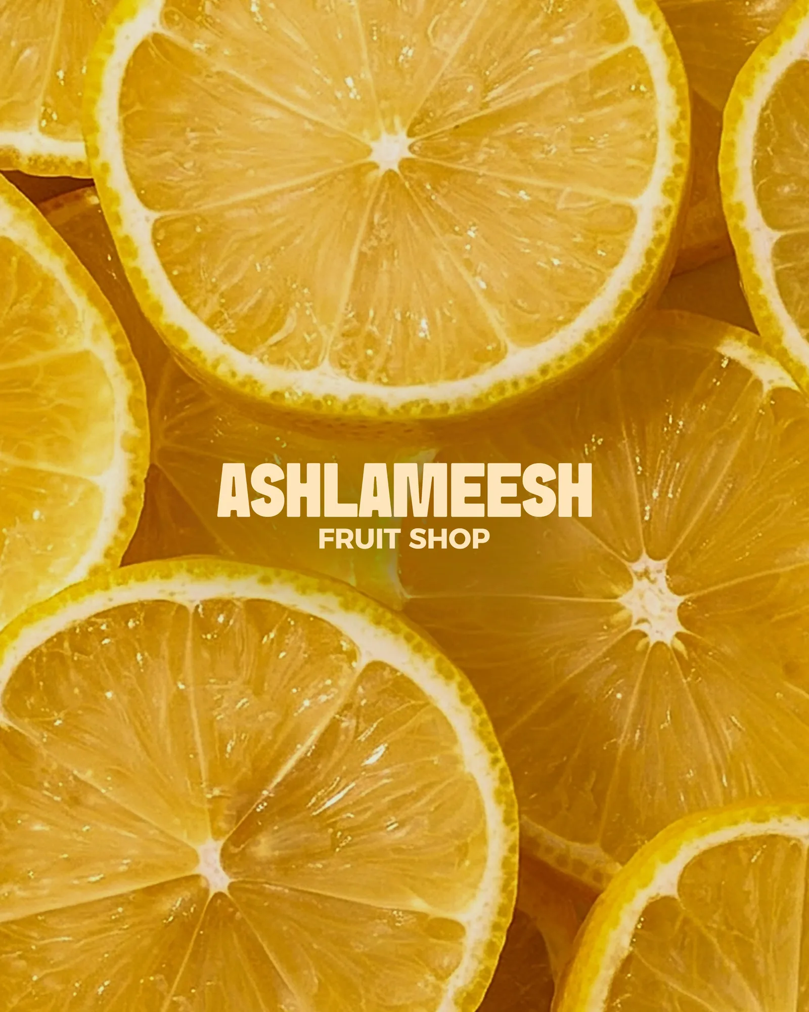
The System
The positioning is stated plainly on the pack — a fruit shop that sells by the piece — and set bilingually in Arabic and English, because in Beirut a brand that only works in one language is only half designed.
Because every badge shares one construction, the set extends cleanly. A new juice, a new season or a new cocktail means a new badge, not a new brand — the practical test of any identity built for a menu that keeps changing.